awards |
|||||||||||||||||||||||||||||||||||||||||||||||||||||||||||||||
|
EXHIBITOR Magazine's
First Annual Portable/ Modular Awards
Finally! Portable and modular exhibits have a place in the spotlight right along with their custom counterparts, thanks to EXHIBITOR Magazine's First Annual Portable/Modular Awards. And according to the competition's jurors, a panel of marketing and design experts, this year's winners prove what many people have known all along: In the hands of the right people, portable, modular, and system exhibits can be just as beautiful, innovative, and functional as any custom build.
 e need an iconic, lightweight, freestanding, rapidly deployable structure that will act as a portable solar-charging station, captivate visitors, and fit in the trunk of a car." When handed this task, most exhibit designers would react with little more than a slack jaw and a blank stare. The folks at Synthesis Design + Architecture (SDA), however, smacked their lips and quickly got to work. e need an iconic, lightweight, freestanding, rapidly deployable structure that will act as a portable solar-charging station, captivate visitors, and fit in the trunk of a car." When handed this task, most exhibit designers would react with little more than a slack jaw and a blank stare. The folks at Synthesis Design + Architecture (SDA), however, smacked their lips and quickly got to work.This extraordinary request came from Volvo Car Spa, which was launching the new Volvo V60 Plug-in Hybrid car in Italy. Teaming up with Fabric Images Inc., SDA designed a one-of-a-kind structure that judges called "a brilliant, incredibly intuitive idea" and lauded it with The Zeigler Award, the competition's top honor. The lightweight aluminum framework was covered with a white mesh fabric, creating an eye-catching, organic structure that could be disassembled and packed into a Fiberglas case that fit into the trunk of the car. A total of 178 photovoltaic cells were integrated into the architecture via leaf-shaped vinyl panels applied to the fabric. Once attached, the cells were wired together and routed down the structure's spine to a main battery supply. Fully assembled and positioned over the car, the configuration provided the solar power to charge the vehicle and created a couldn't-miss attraction that even design-minded Italians had to admit was "Bellisimo!"
 raditional modular exhibit components don't often find their way out of the convention center and into a retail environment. But Accenta Display Corp.'s A-Line brand of modular aluminum extrusions took a walk on the wide side and ended up as a L'Oreal-brand display in a Hudson's Bay department store. raditional modular exhibit components don't often find their way out of the convention center and into a retail environment. But Accenta Display Corp.'s A-Line brand of modular aluminum extrusions took a walk on the wide side and ended up as a L'Oreal-brand display in a Hudson's Bay department store.Designed to promote the new Armani Si fragrance for L'Oreal Canada (a wholly owned subsidiary of L'Oreal Group), the 10-by-10-foot exhibit was also crafted with reuse in mind. After a few months in the Toronto store, the display was disassembled, packed flat, and shipped to the Hudson's Bay store in Montreal. Hailed by judges as "clean and simple" and touted for its inviting graphics and exceptional lines, the structure featured a back wall comprising A-Line extrusions and white and black acrylic panels, which were later changed out for a new campaign. This wall also supported a 40-inch monitor that played the Armani Si commercial. Plain black carpet and a couldn't-miss "Si" black-acrylic cutout completed the scene. 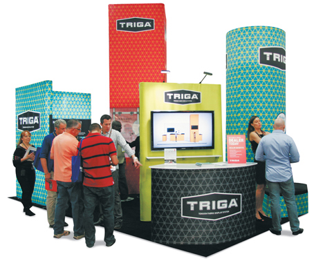
Flair and Function
Best Fabric Exhibit Exhibitor: Triga Systems USA Design: Primary Color, Costa Mesa, CA, 949-660-7080, www.primarycolor.com Fabrication: Triga Systems USA, Costa Mesa, CA, 714-824-8953, www.trigadisplay.us System: Triga Systems USA Event: EXHIBITOR2013 Budget: $40,000 – $79,000 Size: 20-by-20 feet Photo: Primary Color  xhibit-component suppliers have a tricky hurdle to traverse. Essentially, they have nothing to display but their exhibits, so they need to create a spot-on booth design that not only catches attendees' attention but also gives them the opportunity to explore the structure's framework, assess its capabilities, and contemplate its applications. At EXHIBITOR2013, Triga Systems USA sailed over that hurdle with ease. xhibit-component suppliers have a tricky hurdle to traverse. Essentially, they have nothing to display but their exhibits, so they need to create a spot-on booth design that not only catches attendees' attention but also gives them the opportunity to explore the structure's framework, assess its capabilities, and contemplate its applications. At EXHIBITOR2013, Triga Systems USA sailed over that hurdle with ease.Designed by Costa Mesa, CA-based Primary Color, Triga's 20-by-20-foot exhibit comprised multiple structures built using Triga's modular system. The firm then covered the structure in tensioned-fabric featuring rich bold colors and a geometric print that suggested the modular design of the Triga system. A 16-foot-tall tower housed Plexiglas panels revealing the aluminum supports inside, while L-shaped fabric walls showed off the company's backlit solutions and offered a graphics panel touting the system's key benefits. According to judges, the design was "a strong, consistent, visual presence that turned heads on the show floor."
Beach in a Box
Best 10-by-10 Exhibit Exhibitor: Walton County Tourist Development Council Design: Synergy Design Group Inc., New Orleans, 888-267-4893, synergy-dg.com; Zehnder Communications Inc., New Orleans, 504-558-7788, www.z-comm.com Fabrication: Nomadic Display, Springfield, VA, 800-336-5019, www.nomadicdisplay.com System: Nomadic Display Event: BlogHer, 2013 Budget: $40,000 – $79,000 Size: 10-by-10 feet Photo: Exposures Ltd. 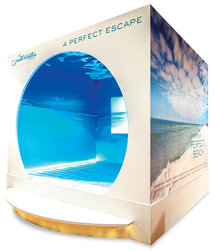
 ow do you create an authentic Florida beach experience inside the Sheraton Chicago Hotel & Towers? If you're the Walton County Tourist Development Council, you build a hollowed-out cube whose interior immerses its visitors in the sights, sounds, and smells of the Florida coast. ow do you create an authentic Florida beach experience inside the Sheraton Chicago Hotel & Towers? If you're the Walton County Tourist Development Council, you build a hollowed-out cube whose interior immerses its visitors in the sights, sounds, and smells of the Florida coast. The Walton County Tourist Development Council is the destination-management organization for 16 distinctive beach neighborhoods on Florida's northwest coast. Hoping to generate awareness for Walton County, the council wanted to create a realistic beach experience for the hundreds of writers and social-media influencers attending BlogHer, held July 25 – 27, 2013, in Chicago. The resulting 10-by-10-foot modular exhibit comprised the DesignLine system from Nomadic Display. DesignLine accommodates rigid aluminum panels and dye-sublimated printed graphics to create a virtually seamless graphics presentation. The exterior featured gorgeous beach photos along with a list of the various beaches in Walton County and the words "Find Your Perfect Beach." The real show, however, appeared within the cube, an area judges called "a special world for attendees." Stepping up onto the exhibit and through a circular opening, visitors found themselves in a seaside oasis. Panoramic photos of a white-sand beach covered the floors, walls, and ceiling, while an 80-inch LED screen on the back wall brought the beach to life with a video loop of rolling surf complete with the gentle sounds of waves breaking. Infused with the scent of coconut, the exhibit – which also took home the People's Choice Award – left a sweet impression on both attendees and the council, as it helped generate more than 400 social-media mentions and 3.2 million Twitter impressions.
 ometimes what is overhead is just as important as what's on the ground. At least that was the case for Milliken & Co., as the glowing boxes over its exhibit captivated attendees and judges alike. "This is an excellent use of overhead graphics treatments to save floor space and differentiate," one judge said. "The color, geometry, and creative rigging of these rectangular elements create a clean, modern booth – and a memorable impression." ometimes what is overhead is just as important as what's on the ground. At least that was the case for Milliken & Co., as the glowing boxes over its exhibit captivated attendees and judges alike. "This is an excellent use of overhead graphics treatments to save floor space and differentiate," one judge said. "The color, geometry, and creative rigging of these rectangular elements create a clean, modern booth – and a memorable impression."Indeed, a memorable impression was one of the objectives set forth by Milliken, which creates additives and colorants used in everything from chemicals and floor coverings to industrial and specialty textiles. However, Milliken also tasked Skyline Exhibits & Design of Greenville, NC, with creating a custom look using modular components. The resulting 20-by-40-foot island exhibit for the 2013 National Plastics Expo comprised rented exhibit framework, internal lighting, and custom graphics. A free-standing, 15-foot-tall, blue-and-white column anchored the front corner of the space while six suspended structures took center stage. Two white, Milliken-branded boxes hung aisle side, and four cubes – each one featuring a different hue and text – dangled directly over corresponding product displays. For example, the crimson "Weight Reduction" cube hung above a display of car parts whose weight had been reduced thanks to the use of the company's Hyperform product. Attracting attendees in from the aisles, the cubes then helped them identify areas of interest within the space, and if they wanted a confidential chat, a conference room at the back of the space offered ample privacy. For Milliken, turning attendees' eyes up to the skies also created an upswing in exhibit traffic.
Scare School Redo
Best Use of Graphics Exhibitor: Pixar Animation Studios Design/Fabrication: Group Delphi, Alameda, CA, 510-749-6890, www.groupdelphi.com System: Group Delphi Event: Siggraph, 2013 Budget: $80,000 – $149,000 Size: 20-by-30 feet Photo: Line 8 Photography 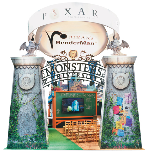
 reating beautiful graphics isn't exactly a walk in the park. But crafting stunning graphics
that recreate characters and scenes from a well-known animated movie is more like a walk down a dark alley armed with nothing but your adrenaline and a pair of Sketchers. Nevertheless, the folks at Group Delphi overcame this frightening challenge and created a graphics-laden exhibit that brought the world of "Monsters University" to life. reating beautiful graphics isn't exactly a walk in the park. But crafting stunning graphics
that recreate characters and scenes from a well-known animated movie is more like a walk down a dark alley armed with nothing but your adrenaline and a pair of Sketchers. Nevertheless, the folks at Group Delphi overcame this frightening challenge and created a graphics-laden exhibit that brought the world of "Monsters University" to life.The 20-by-30-foot booth launched at Siggraph 2013 was crafted to promote Pixar Animation Studios' RenderMan – a software that renders visual effects (VFX) to create graphics for film and television – and to underscore the fact that RenderMan was used to create "Monsters University." Comprising Group Delphi's own portable/modular system, the design featured a 20-seat classroom-style theater, and a 17-foot-tall entry arch. The tensioned-fabric graphics on the arch mimicked the university entrance from the movie, and the realistic columns doubled as storage closets. On the aisle-facing back wall, additional graphics represented the university exterior and Art, a big-toothed, purple monster from the film. Meanwhile, a cardboard cutout of Mike Wazowski (the short, green, one-eyed star of the movie) seemingly running with a stack of books appeared next to the classroom's chalkboard. According to judges, this mix of graphics "clearly communicated the brand message and immediately signaled to visitors that they were entering an experience, not just another exhibit." Mixing portable/modular components with stellar graphics, Pixar's "Monsters University" booth taught us all a thing or two about effective exhibit design.
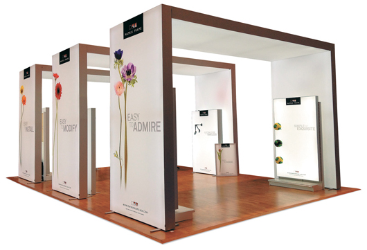
he designers at Matrix Frame BV must have taken a lesson from writer William Golding, who once said, "The greatest ideas are the simplest." That's because instead of crafting a complicated exhibit with a multitude of components, the provider of modular-frame systems opted for an exhibit comprised almost entirely of simple yet oh-so-effective internally lit arches.Hoping to woo attendees at GlobalShop 2013, a retail-design and -marketing show held in Chicago, designers used a series of three 12-foot-tall arches to define the 20-by-30-foot space and create a store-like feel within them. But at the same time, the arches, made of double-sided LED perimeter-lit light boxes, helped to maintain an open feel and generate a natural traffic flow into and within the booth space. In keeping with the exhibit's unofficial "less is more" theme, the exterior graphics featured only colorful images of various flowers, the Matrix Frame logo, and the words "Easy to Install," "Easy to Modify," and "Easy to Admire." The interior of the space was equally uncluttered as it offered little more than six of the company's new fabric light boxes with magnetic shelving, which were discretely located on the interior sides of the white arches. What's more, the easy, straightforward design also gave a nod to Mother Nature, as its polyester fabric was made from recycled materials, and the dye-sublimation printing process used water-based ink. Described by judges as "an awesome bang for the buck," and "an impactful, clear, and on-brand execution," the minimalist design is indeed a simple – but great – idea.
|
|||||||||||||||||||||||||||||||||||||||||||||||||||||||||||||||


Marketplace

- Audiovisual Equipment
- Convention Centers
- Event Design and Production
- Exhibit Fabrication
- Exhibit Producers
- Exhibit Rental
- Experiential Agency
- Flooring
- Graphics
- International Exhibit Producers
- Kiosks
- Lead Retrieval
- Modular Exhibit Systems
- Portable Display Systems
- Shipping and Transportation
- All Companies
3048R Sales and Marketing Alignment: How to Get ‑ and Stay ‑ on the Same Page
Feb. 10, 2026
3011R How to Grow Your Brand: Incorporating Brand Marketing into Your Exhibit Program
Feb. 19, 2026
4101R Boost Up: Promote Yourself from Service Provider to Strategic Business Partner
Mar. 3, 2026
6020R The @show Experience: Understand the Essentials of Exhibit Design
Mar. 10, 2026
7058R Authors Executive Series: Thrive Under Deadlines: Strategies for Success
All Sessions >>